
Increasing a Restaurant’s Revenue by 59%
Introduction
Our client was a local restaurant owner who wanted a custom website. It needed to expand on the restaurant’s aesthetic while also improving the overall online ordering experience. This would require a full website revamp, with a new, strategic approach to the customer journey. To achieve this we paired a brand enhancement with a new strategic approach for the website.
Challenge: Simplifying the User Experience
Our client had an existing website, but upon our audit we discovered there was no established layout and lacked brand cohesion. We were challenged with developing a site that drives traffic to their online ordering platform all while showcasing the restaurant’s ambiance. It was a necessity to be able to easily update menu items and manage content at a moment’s notice. The client was also facing difficulties in managing and adding new food items to her website, so we proposed a platform that provides easy to use content management and updates.

Solution: Identifying User's Need, Owner's Goal & Creating a Platform That Work
We started by redesigning the structure with a goal of streamlining the user experience. This means we prioritized what users wanted to see, which was menu offerings.
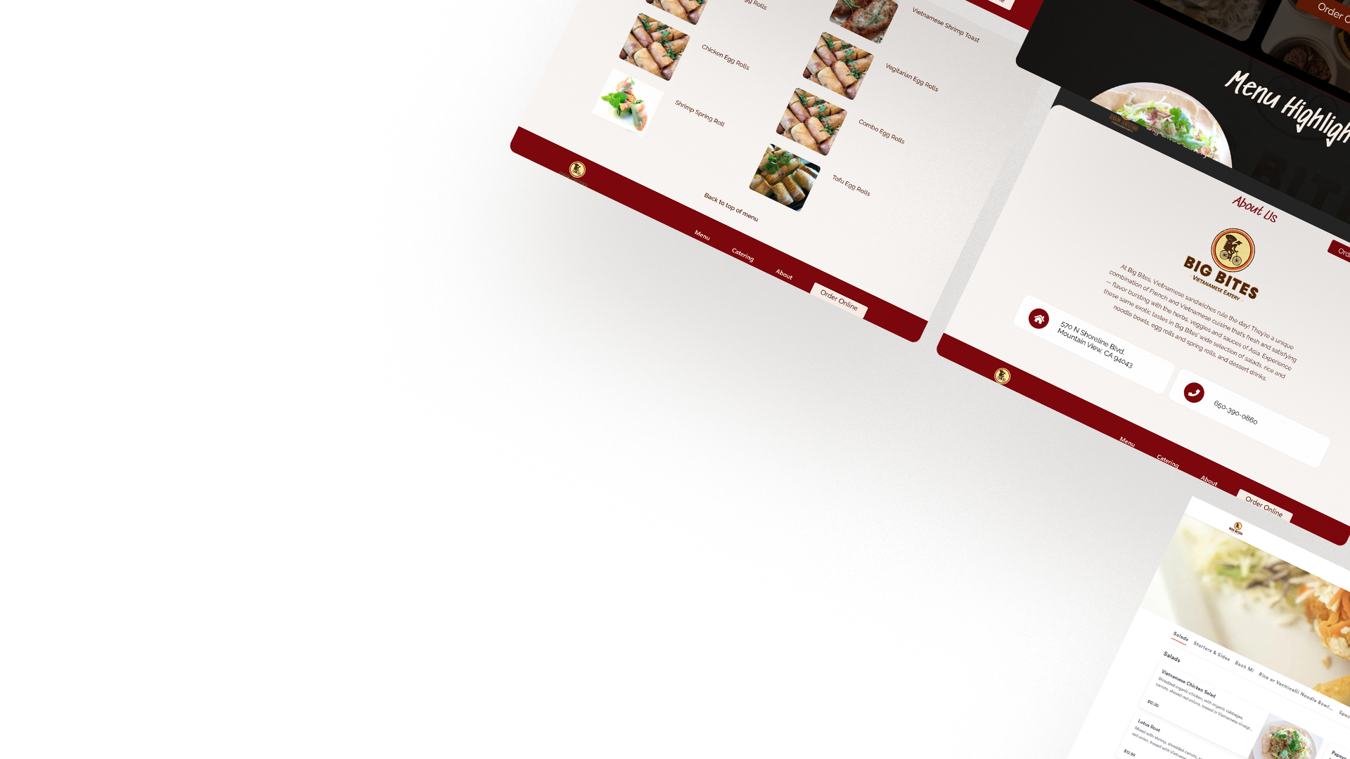
We created two design solutions to test and see which one users enjoyed the most. This resulted in us moving forward with a design that highlighted menu items on the home page. The remainder of the design focused on funneling users to our client’s ordering platform.
A core feature of any restaurant website is its food and online orders. For this website we developed a menu that allows users to filter by category linked to an external platform for online orders, pick up requests and delivery.

Process:
Rebuilding the Information Architecture
By drilling down to the foundation of the website mapping its current information architecture. It was immediately apparent the site was not funneling users to an end goal, which led to a new information architecture that focused on the menu, catering, and online ordering.

Brainstorming
We started drafting LOFI prototypes, which would give us something tangible to test the assumptions we made earlier. These two options seemed equally effective but only testing would tell.
Rapid A/B Testing
So far in this design process, we assumed what the user’s needs were, and only testing would validate our ideas. We constructed a test with a series of questions and a task to compare the performance of each prototype and enable us to make a design decision.
Testing Results
Prototype A was more effective and had a better user experience than its counterpart because it presented highlighted menu items on the home page and had a shorter ordering process. This rapid test removed assumptions by providing evidence that backed our design solution which gave us confidence moving forward.
Visual Design
It was important to the client that the website communicated the restaurant’s authentic Vietnamese cuisine. Sifting through Vietnamese culture articles observing how their culture evolved over time in an effort to build a user interface that was an extension of the restaurant.
We achieved this by picking elements from Vietnamese culture and weaving them within the style guide.
Outcome – Results
After we launched we saw an overall increase in visitors, online orders, and revenue.


““Highly recommended! William and his team are great, very responsive and easy to work with. I would hire them again for a new website””